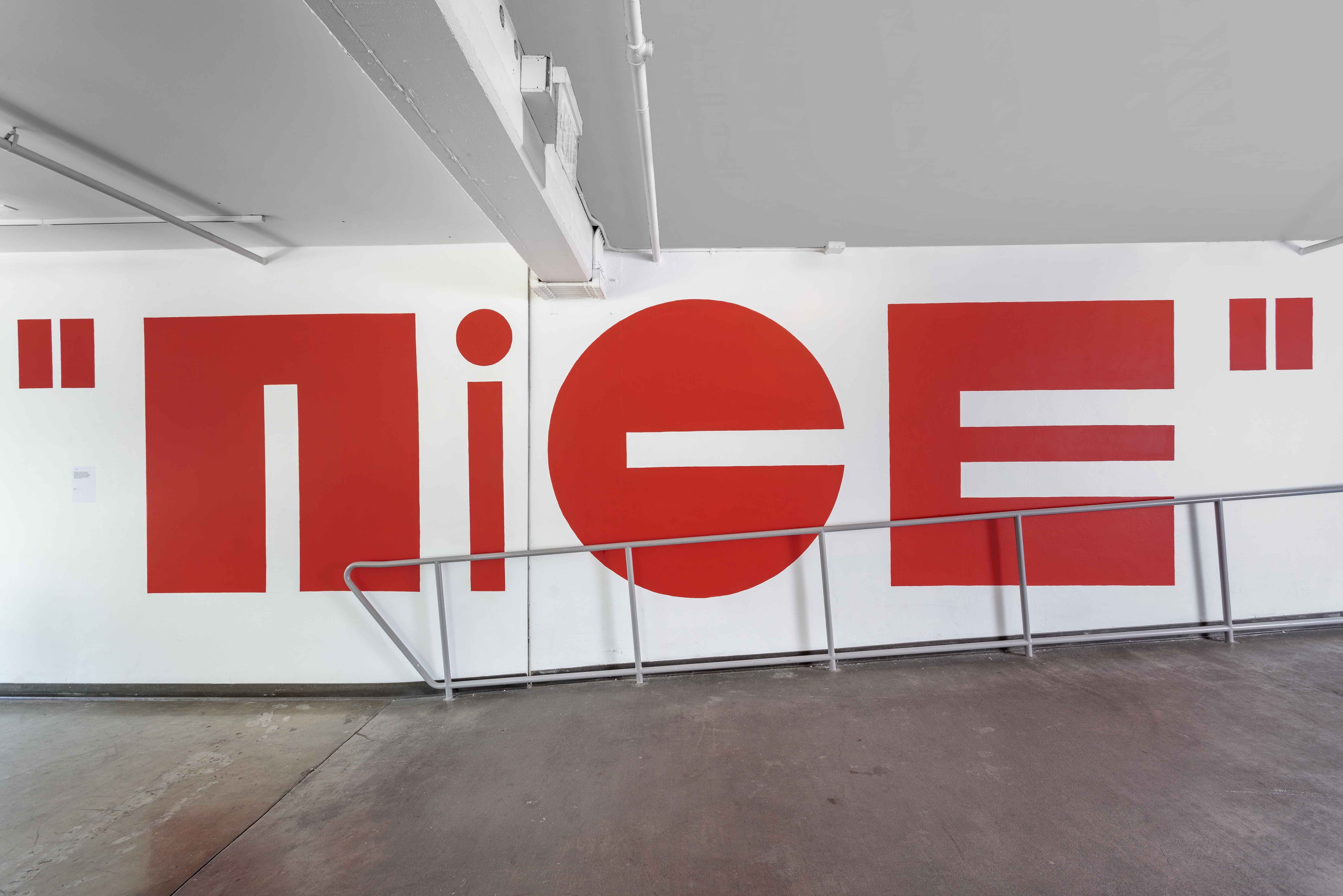
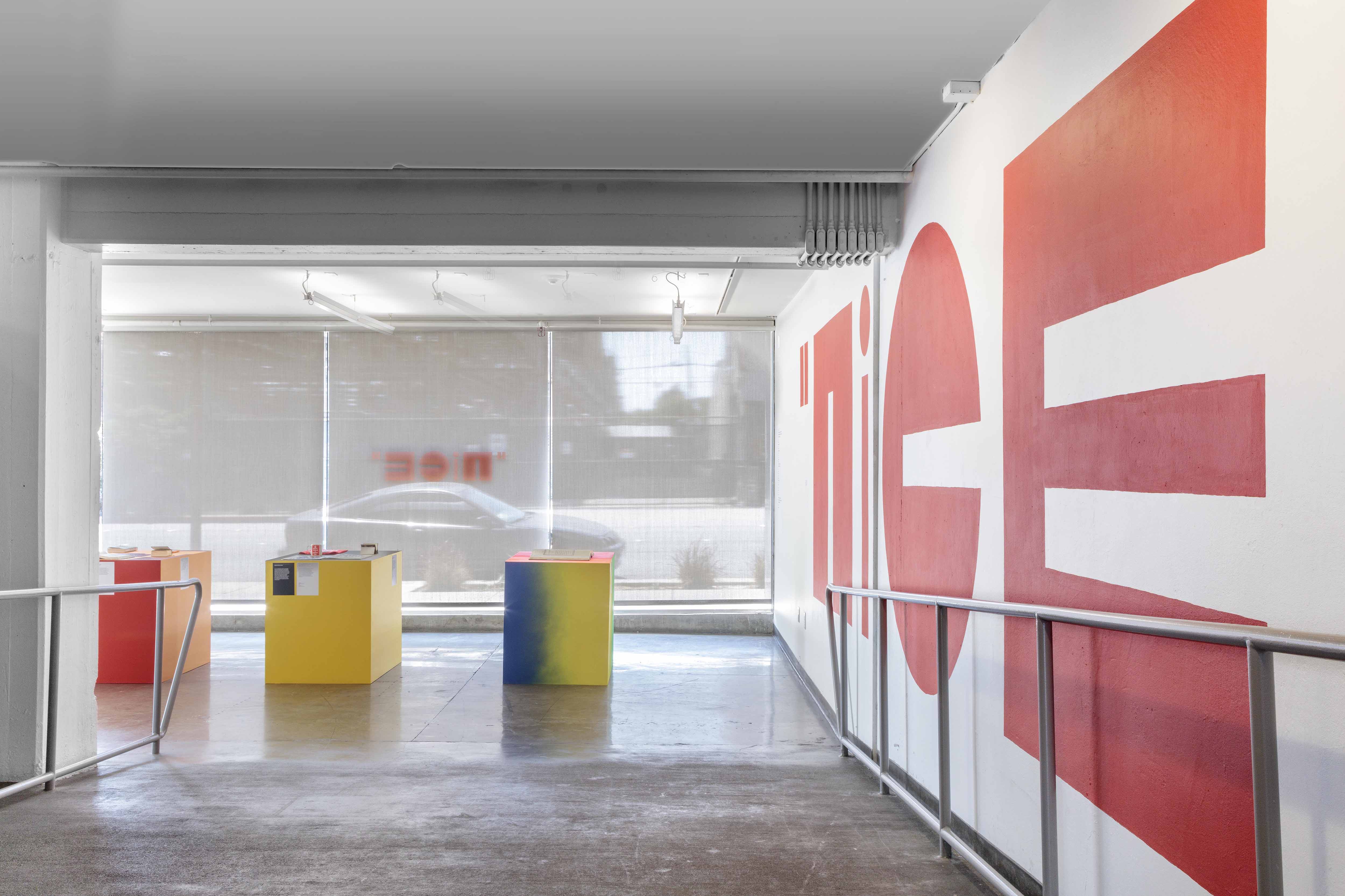
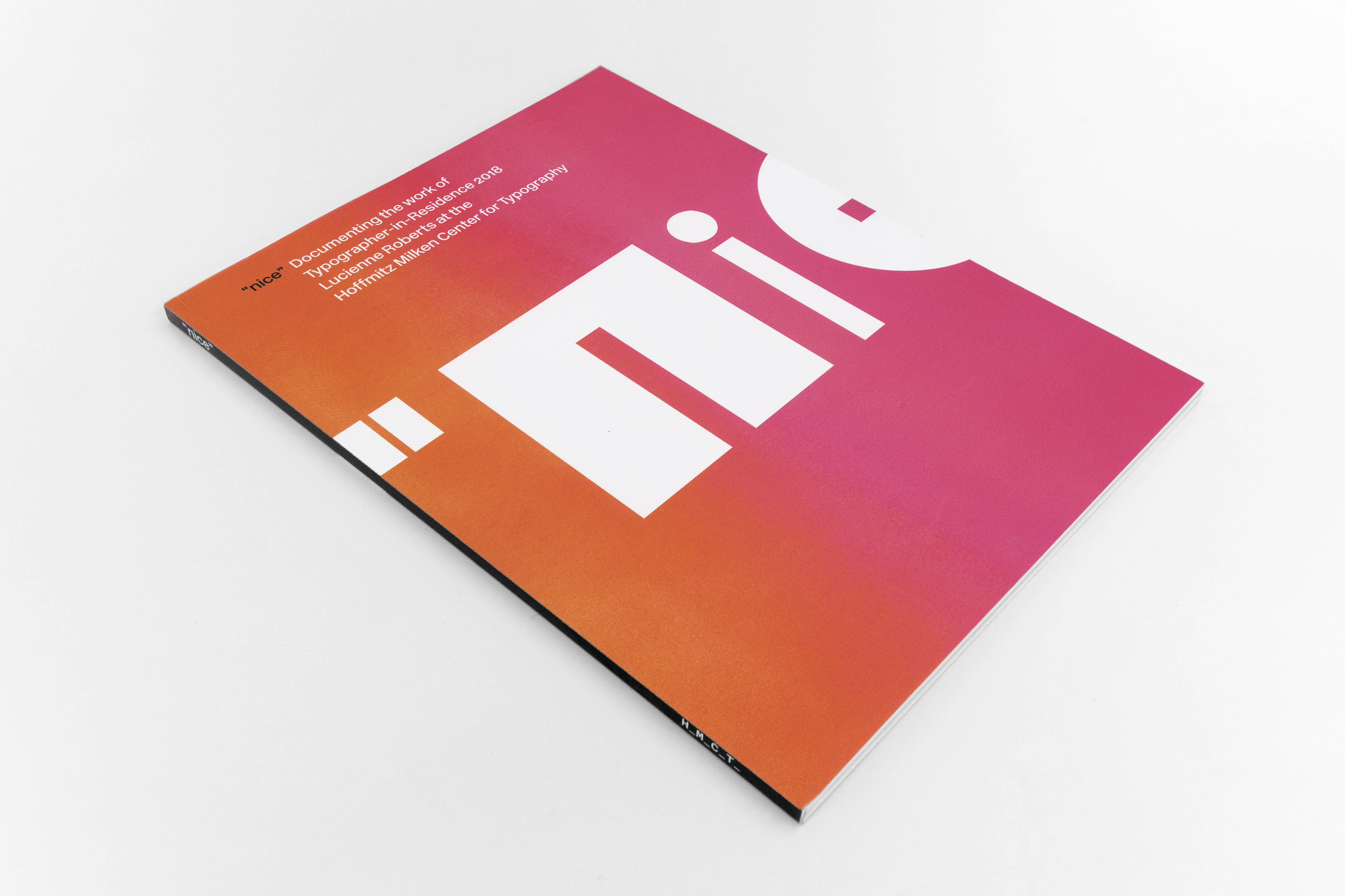
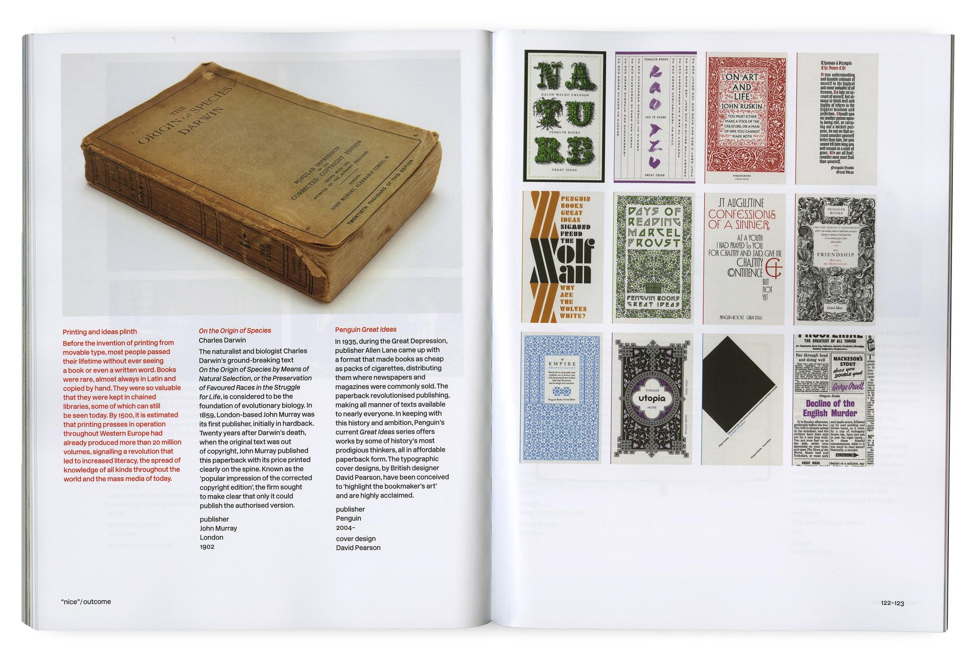
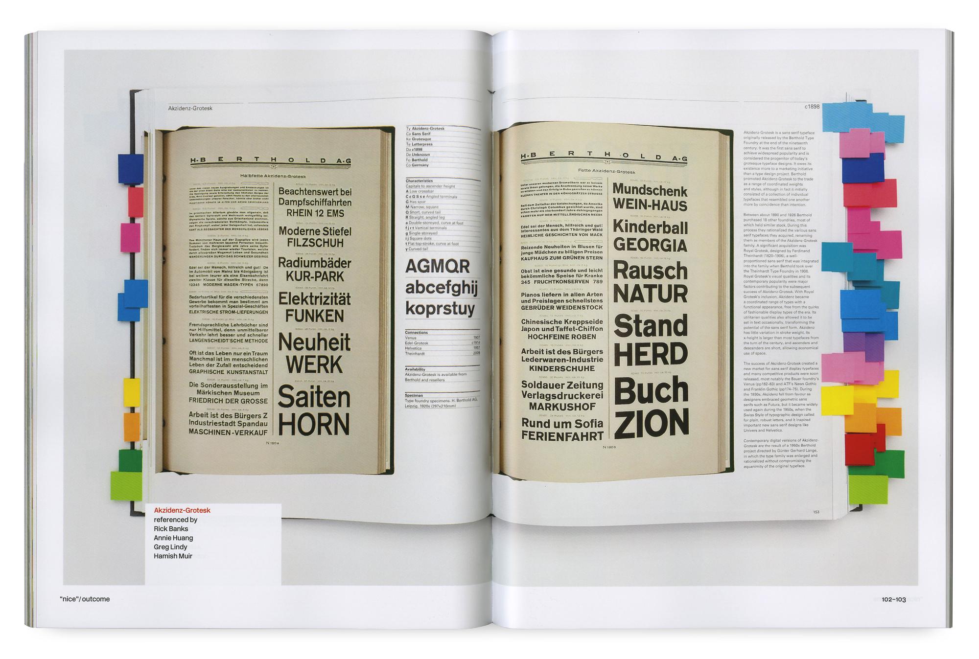
Nice is the result of the typography residency program offered annually by HMCT. As that year’s appointed Typography Fellow, I worked closely with Typographer-in-Residence, Lucienne Roberts, on the research, development, and curation of the exhibition and design of the catalog.
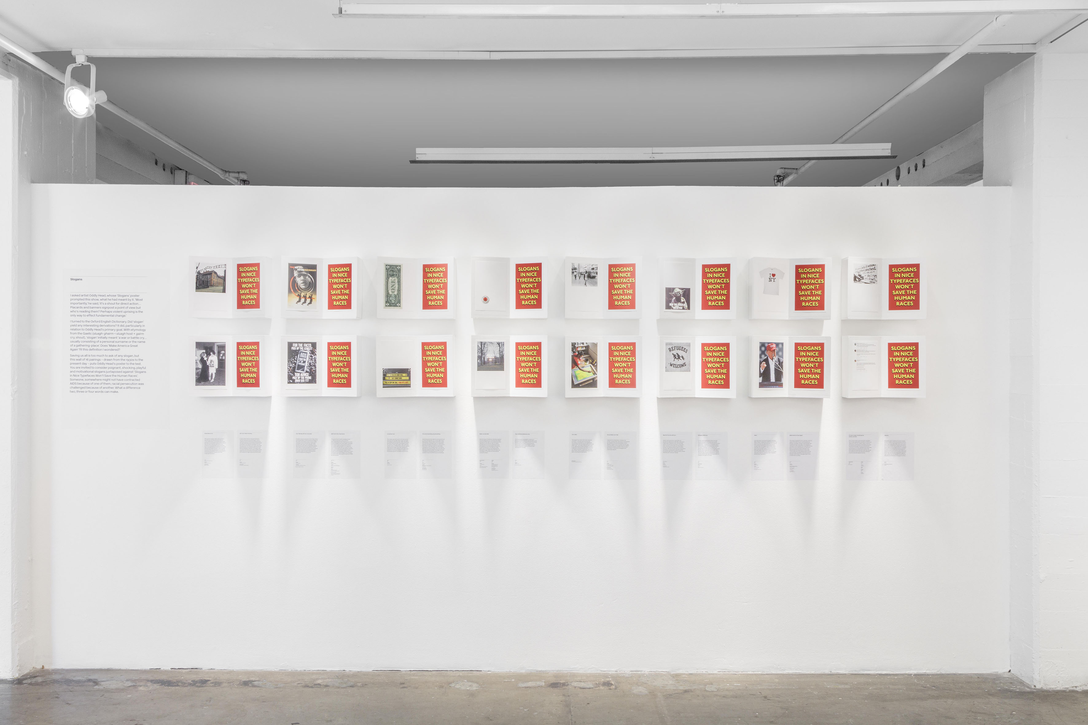
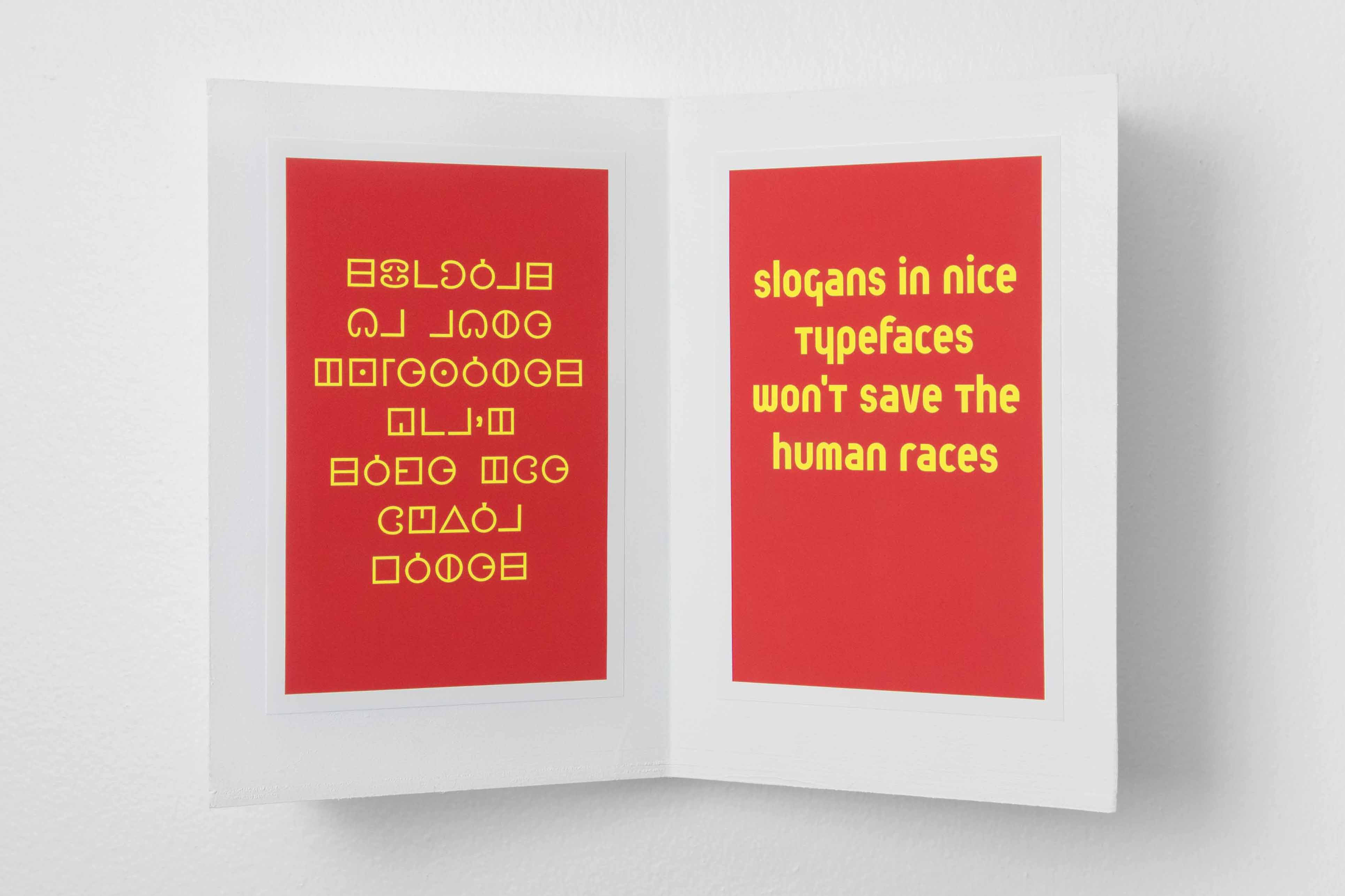
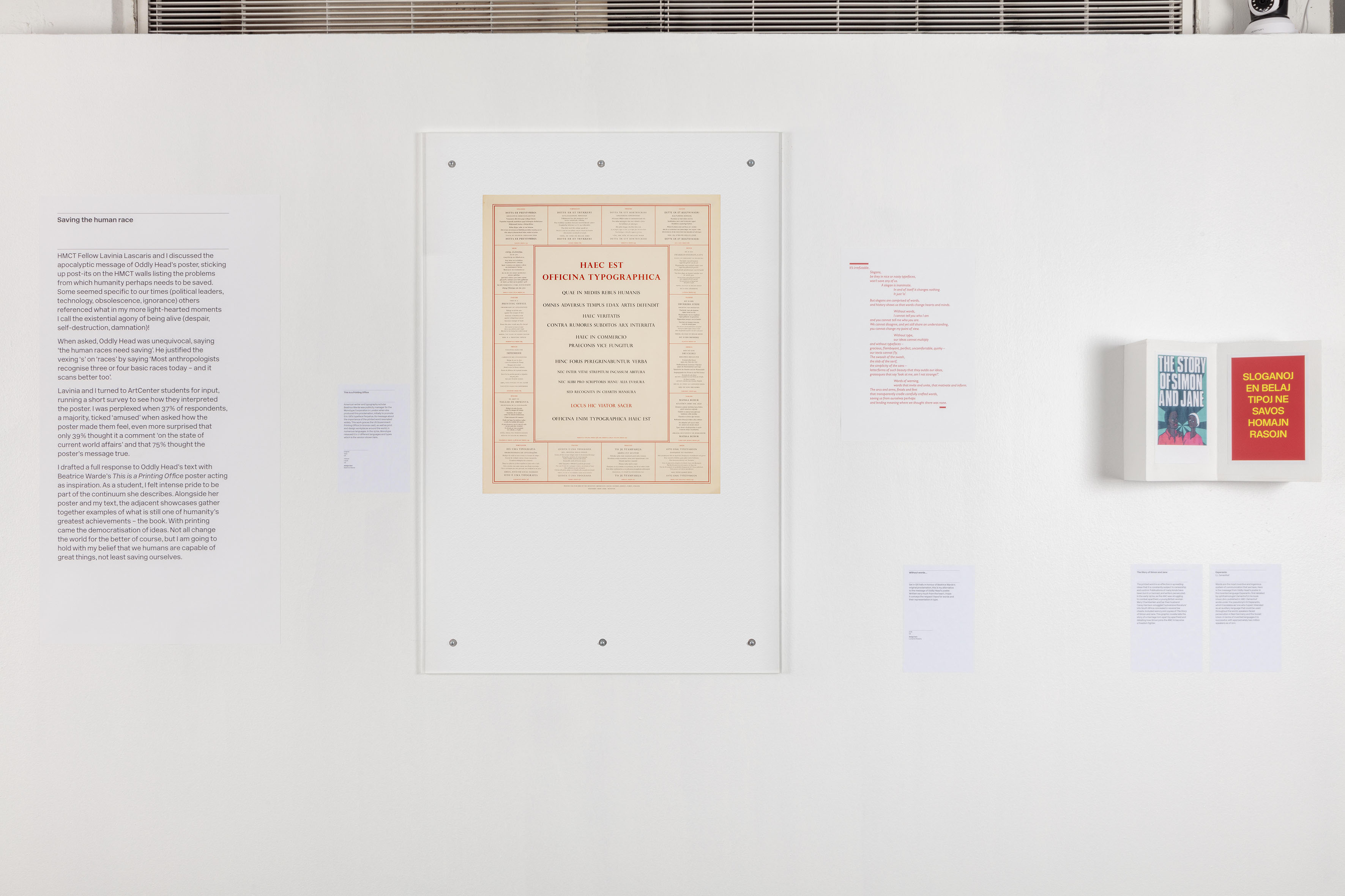
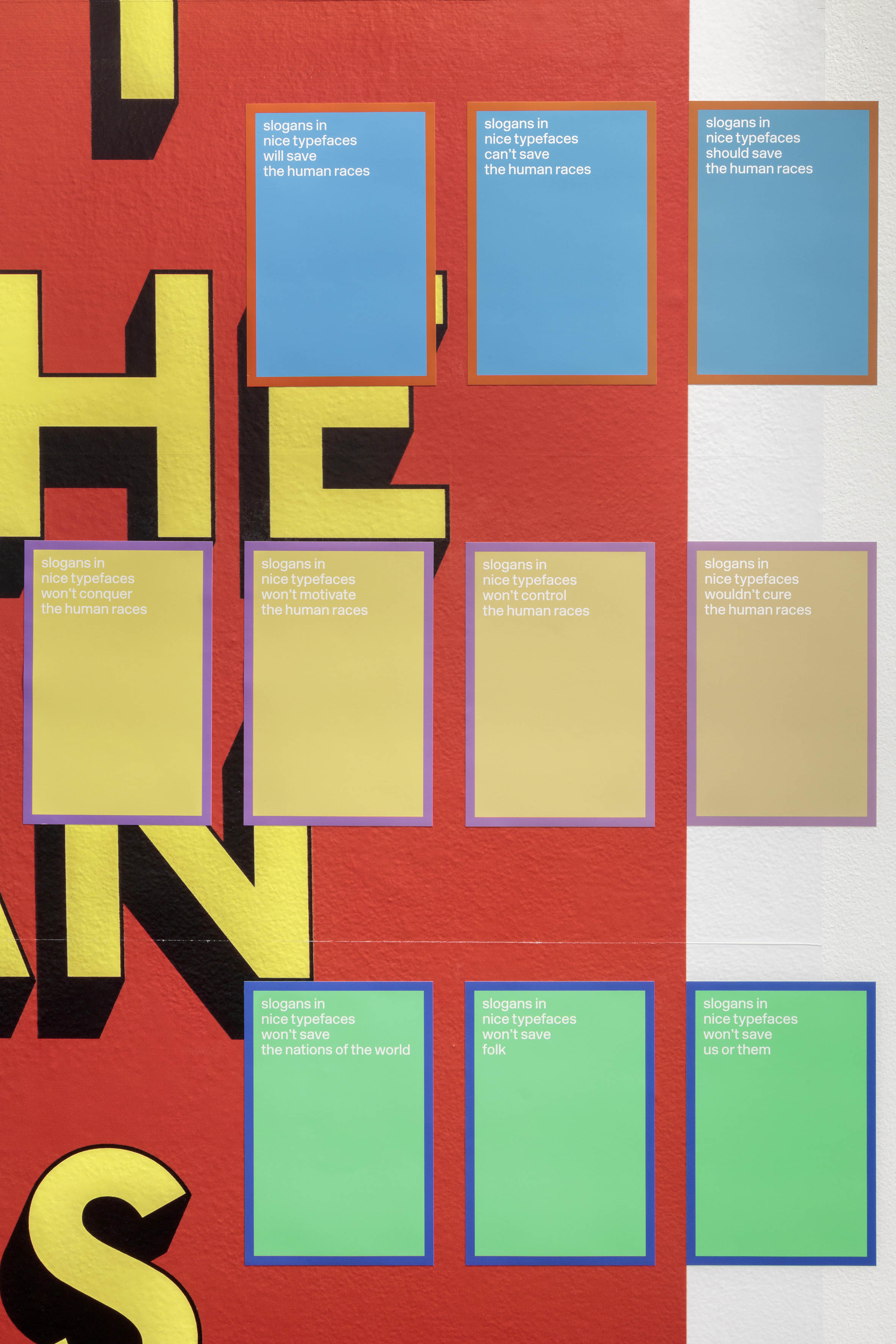
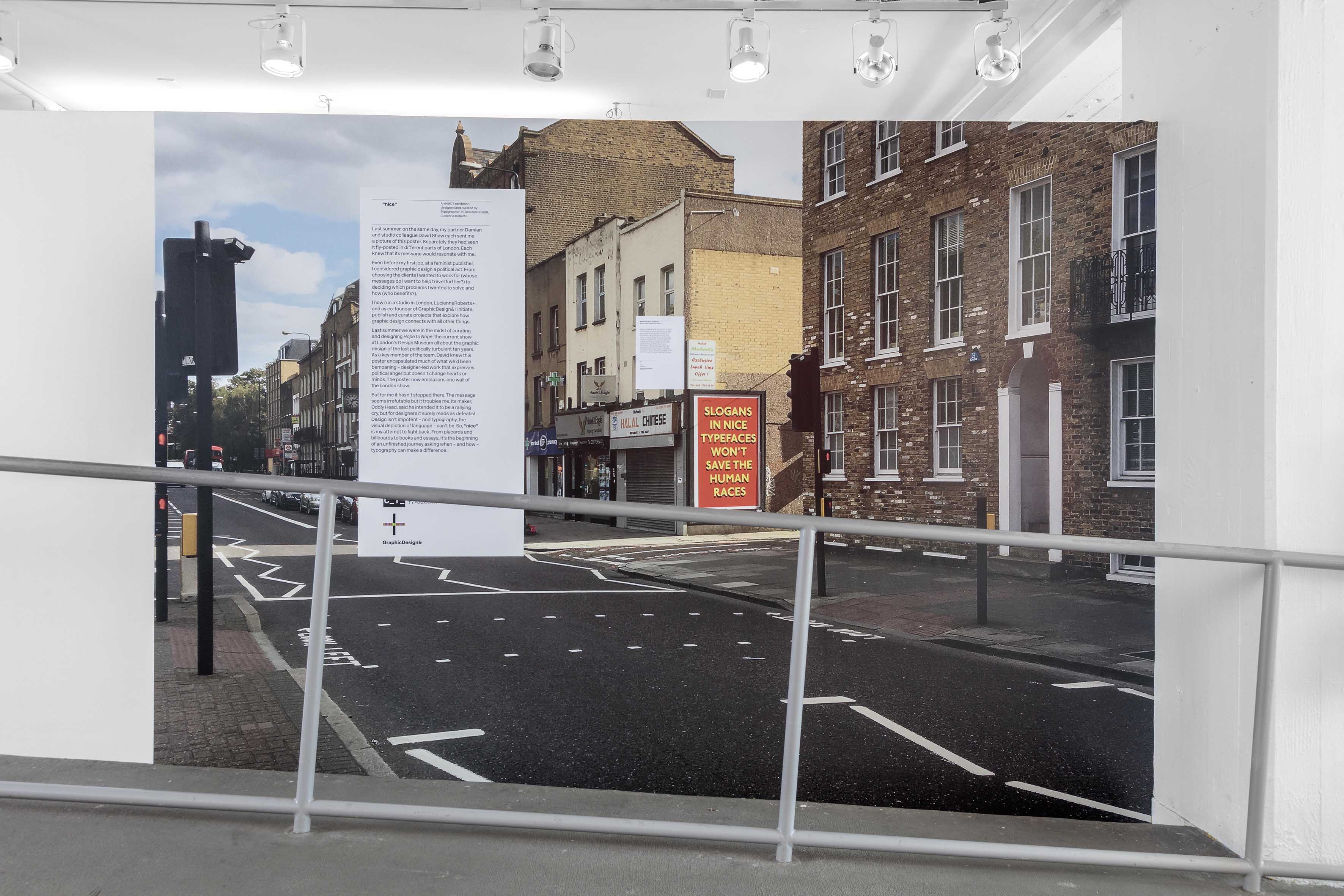
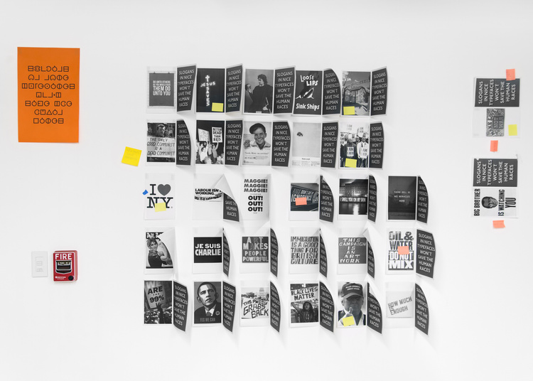
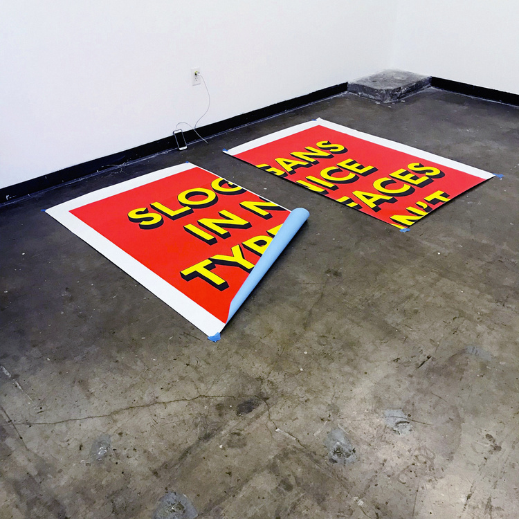
Slogans in nice typefaces won’t save the human races. This provocation served as the starting point for Nice. The poster appeared in UK city streets in late 2017 via Flyingleaps. It was created by British artist and graphic designer Oddly Head. The bold graphic slogan was a response to what he calls ‘an epoch of demagoguery and debacle’ and was popular across social media.
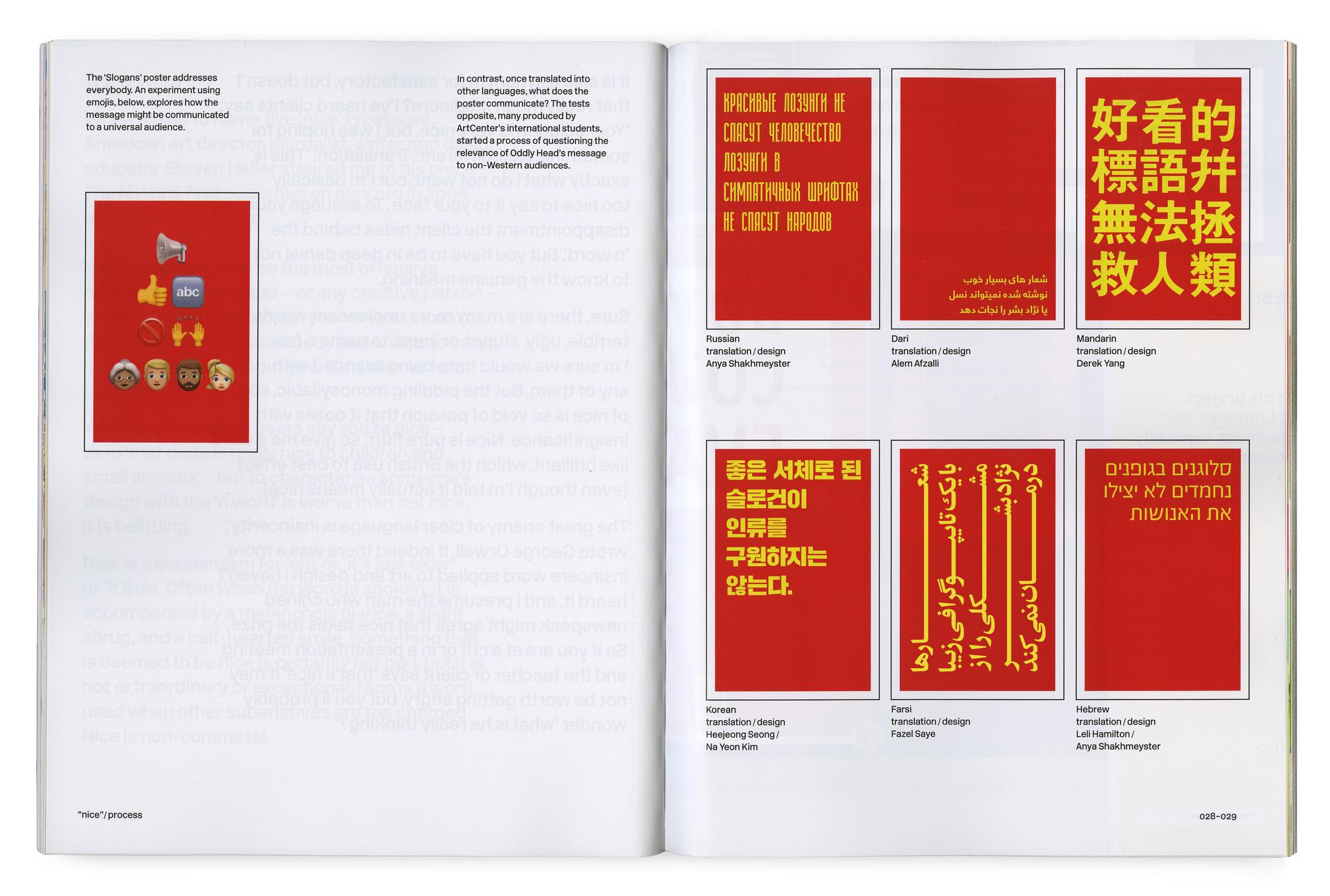
Relevant to the UK and USA, if not the whole world, the message of this poster is apocalyptic—the human race needs to be rescued. Furthermore, it warns of the dangers when meaning and aesthetics become disassociated and designers design primarily for themselves.
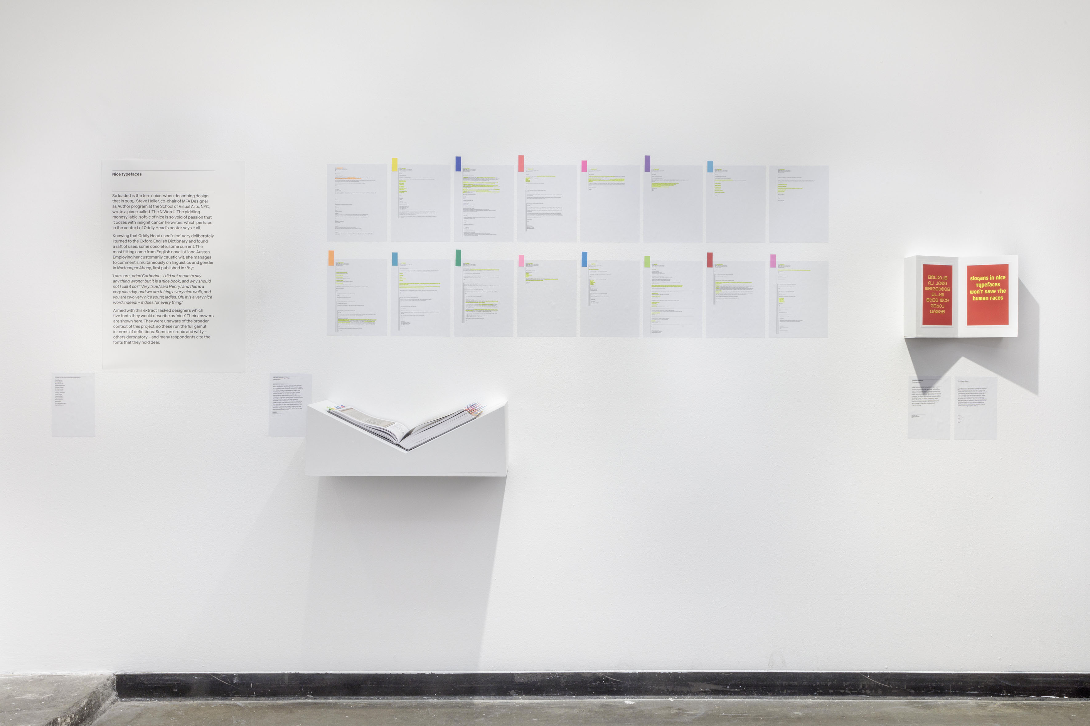
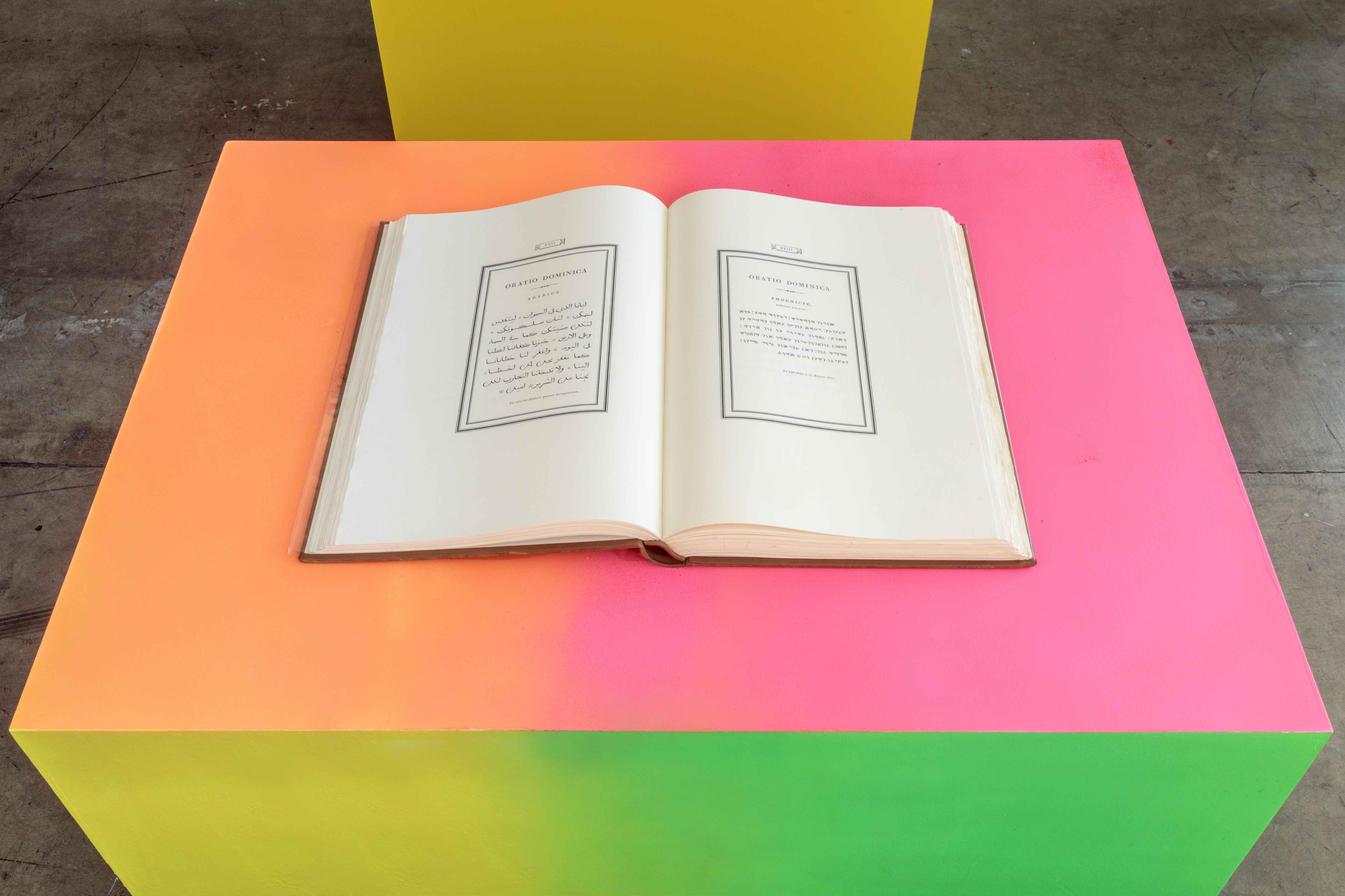
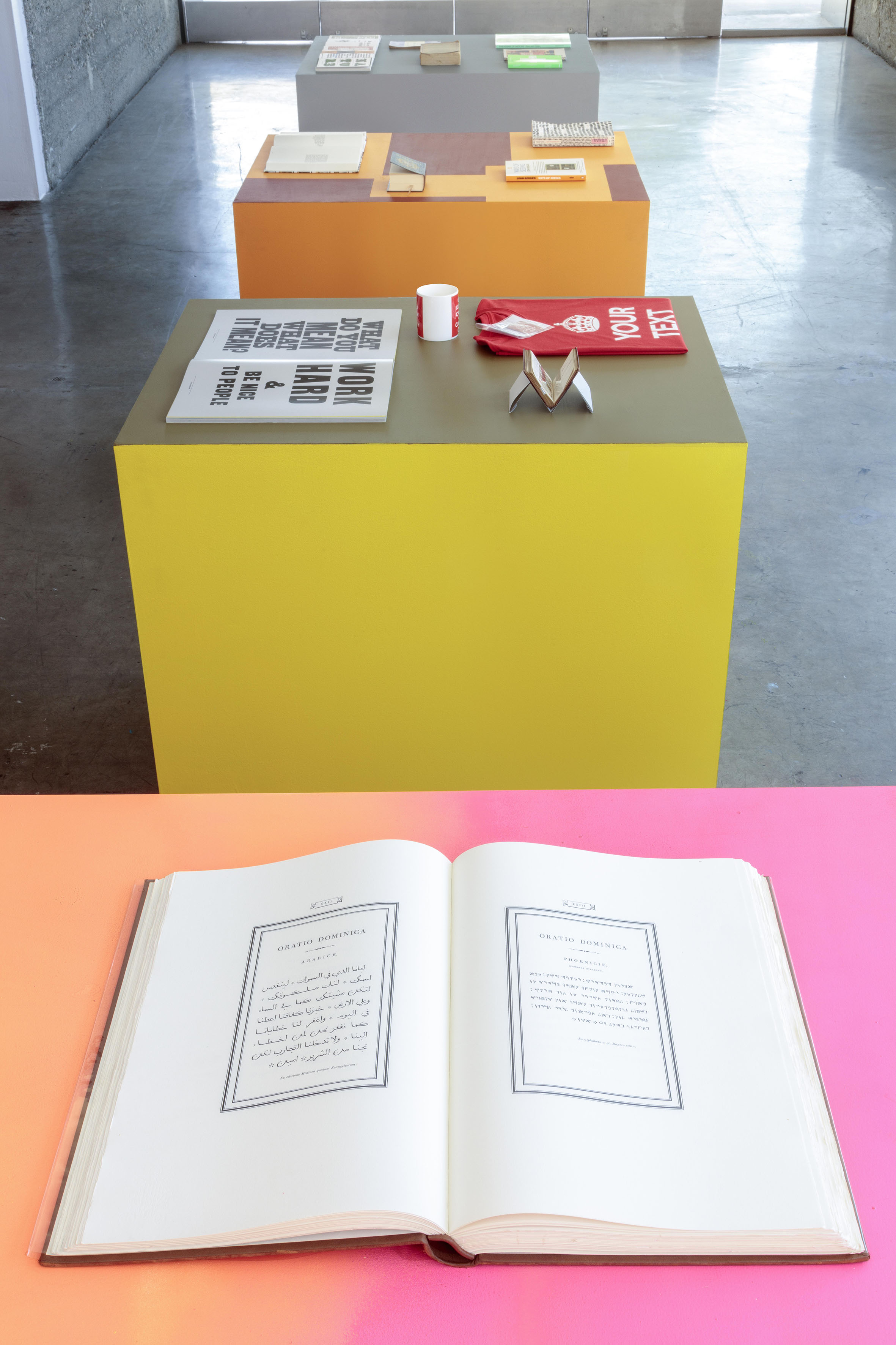
The exhibition was the outcome of deconstructing the poster and identifying the power of slogans, the definition of a “nice typeface,” the influence of texts in relationship to typography, and the threats from which the human race needs to be saved. In essence, Nice is an exploration of the ways that slogans (or texts) in nice typefaces might save the human races after all.
Press: Print Magazine / Creative Review / Eye on Design
Project origination, curation, and art direction: Lucienne Roberts
Research and design assistance: Lavinia Lascaris
Additional research: Lorna Fray
Additional image research: Anabel Navarro
Additional design support: David Shaw, John McGill
Technical support: Joshue Molina, Jorge Ruano, Lulubi García, Roberto Rodriguez, Jimena Gamio
Photography: ©Joshua White, Lavinia Lascaris, David Shaw
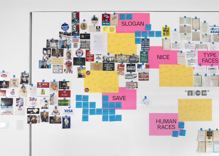
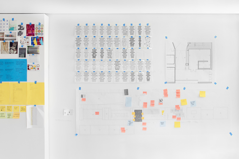
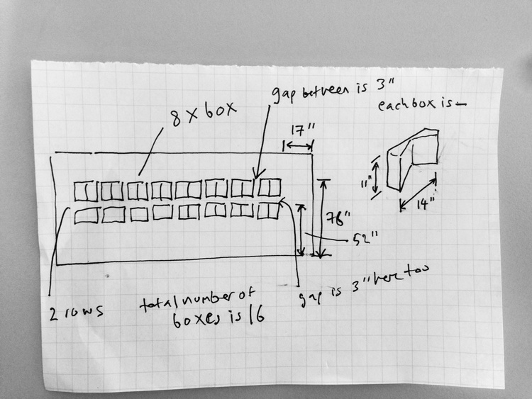
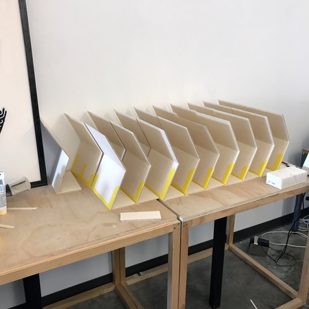
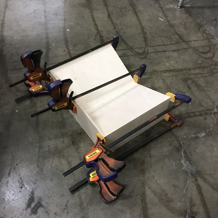
Process
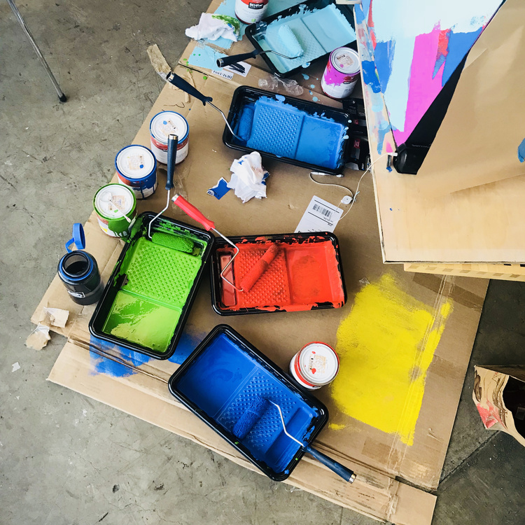
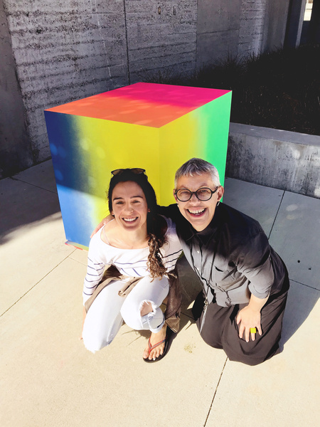
Below are photographs from our studio space at HMCT that
display thoughts, ideas, inspiration, and conceptual development. It
also includes some documentation from the production process of the
exhibition.
